
How Do You Know You Have Hired the Best Website Designing Company for Your Website?
.webp&w=3840&q=100)

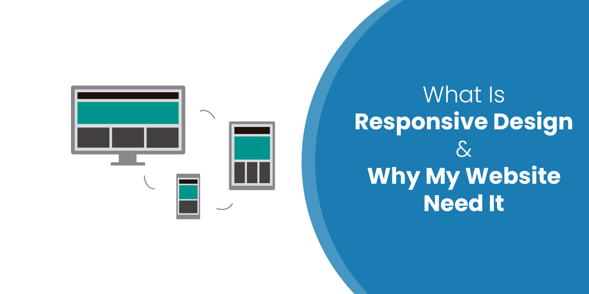
The growth of your business needs a website. Creating a website may be a bit easy but creating a website that is also mobile-friendly could be a difficult task. The majority of business experts spend their blood and sweat to create an impactful business website but fail to attract a majority of the audience. Do you know why? This is because web creators forget about the mobile audience and do not focus equally on their mobile web designing. Every business website to grow should opt for mobile website design because it generates the highest amount of viewers and potential clients to your business website.
A good website designing and development company never ignores its mobile audience knowing their value for the increment of conversion rate and user experience of their website.
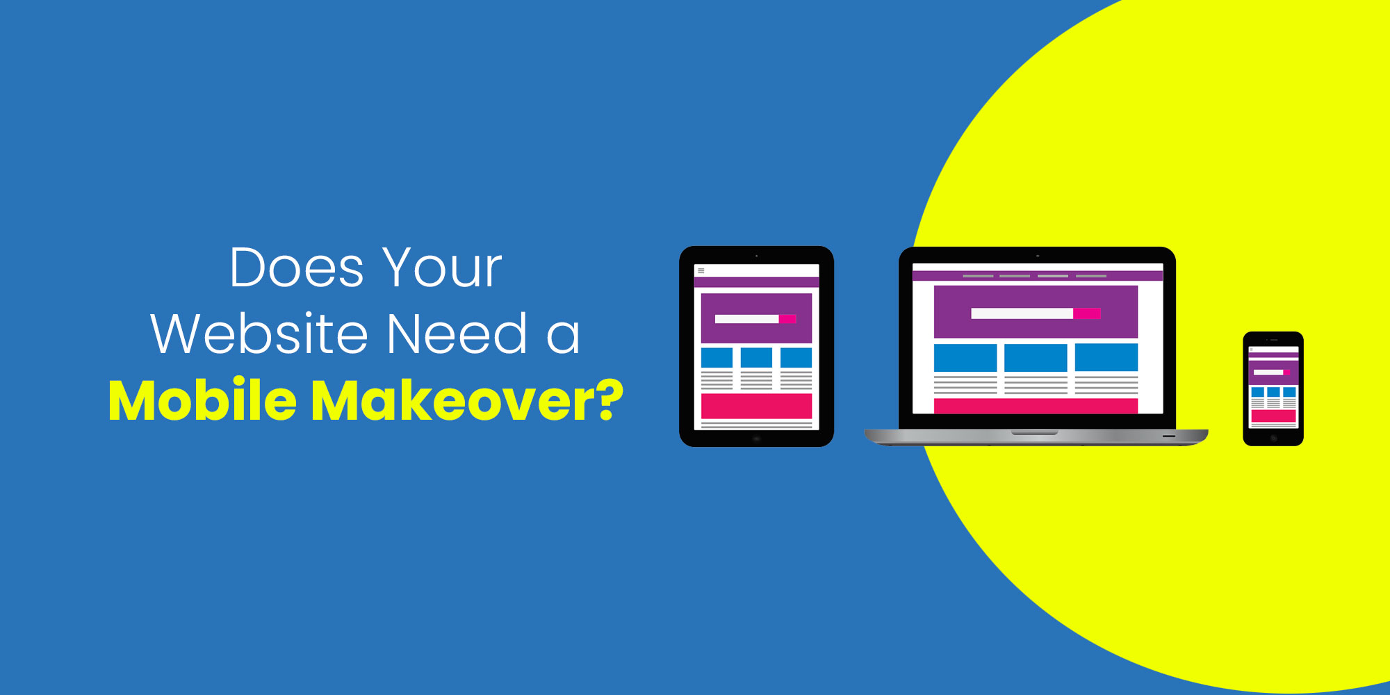
Even if you have a well-designed website serving potential clients, you will always need a mobile makeover. Here’s why
The digital age has already announced the need to develop websites that attract and influence viewers if you aspire to grow your business on any digital platform. Users are more addicted to technology, everybody owns a smartphone, surfs the internet on their mobile and seeks to have all the information in their palm.
The arrival of smartphones has changed the way of conversation of people. Almost 85% of the population uses mobiles and smartphones to shop online, order food, buy products etc. If your website is not mobile-friendly you can easily lose this 85% mobile audience which will automatically reduce your website’s conversion rate and will degrade your website’s position on search engines. So designing a website that’s mobile friendly will grow more audience engagement and audience interaction with your business.
Your website should be designed in a way that it’s easy to use. Mobile screens are small and hence no complications are required. Your website should only have information that is relevant and does not confuse the audience or shift their focus. Use search bar options, buy-now options and add-to-cart options to make surfing easy.
Content is the key to any website, it attracts buyers and leaves no room for confusion. Keep your content short, simple and to the point. This will provide relevant brand information to the users and will avoid hassle.
Your website should contain original images and not stock pictures. Adding original images of your brand or product gives a more clear idea of your brand to the customers. Everybody knows the fact that images speak more than texts, providing an image that defines the features and specialities of your brand can be a boost for your mobile website.
Mobile websites should always be easily scrollable and have navigation options. Do not set up your users to pinch and zoom because it contains it creates chaos for the customers especially when it comes to filing any form or survey. Your website should have checkable boxes and scrolling menu bars to make the data entry simple. Less content leaves the option to write your content large and text size can be made simple and big which leaves no important information hidden.
A website that does not scale for different devices is not likeable and gains less trust from the customers. Make sure your website is scaled properly to function on all devices. For better adaptability of your website design your website in such a way that it works well with both landscape and portrait view. Avoid using Flash designs because they do not work on many devices, especially on iPhones and iPads.
The interface of your website should be designed according to the convenience of the viewers or the customers. Customers regularly check for services, so make it easy for them to find your website while using their mobile phones. Try using Click to Call, Maps, Facebook, Twitter, Foursquare, Email, Linkedin, Tumblr, FormField Submissions and other options to invite more customers. This will develop more convenience for your buyers.
A mobile-friendly website has always increased the growth rate of the website as it develops a platform to grow more customers increasing the usability of your website.